


See How We Helped Gliffy Update Its Image And Drove More Targeted Traffic
Editor’s note: Today’s blog post is written for submission to the 2018 HubSpot Impact Awards.
Show, don’t tell.
.jpg?width=300&height=140&name=GLIF-header%20(1).jpg) It’s an old adage in creative writing that means rather than tell people what’s happening, create a scene where they can experience it firsthand. It’s advice equally applicable to marketing and words that gave direction to our recent redesign of Gliffy’s website.
It’s an old adage in creative writing that means rather than tell people what’s happening, create a scene where they can experience it firsthand. It’s advice equally applicable to marketing and words that gave direction to our recent redesign of Gliffy’s website.
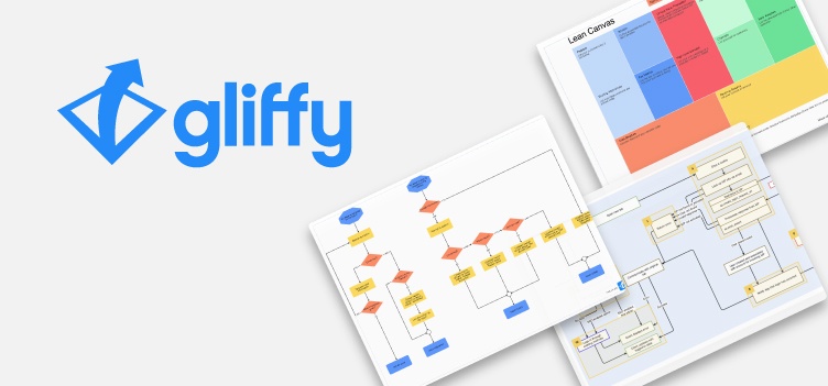
Even if you don’t know the Gliffy name, you’ve likely encountered Gliffy if you’ve ever made a diagram or chart online.
Gliffy was founded in 2005 as the world's first net-native business graphics application. Its flagship software, Gliffy Diagram, boasts a simple drag-and-drop interface and ready-to-use templates that make it easy to create a variety of visuals online – from UML diagrams, wireframes and flowcharts to network diagrams, business process modeling and org charts.
But creating visuals is just the start. Gliffy is also a powerful tool for visual communication, allowing users to quickly share and collaborate with others. And thanks to a deep integration with Atlassian, you can also add visuals directly in Jira and Confluence for more productive and efficient teamwork.
Success Spawns Competition
Every good idea spawns imitators. And after Gliffy’s success, competitors emerged. Most offered features similar or identical to Gliffy’s, but few had the advantage of new websites designed with an eye toward visual appeal, customer trust and SEO performance.
Gliffy approached Square 2 Marketing with a challenging request. Create a website that:
- Reflects the company’s personality and tech roots with a clean, modern design
- Improves SEO, maximizes organic traffic, reduces bounce rate and increases dwell time
- Increases trust and confidence
- Bolsters its position among the competition
- Sets the stage for the launch of its new product, Gliffy Project
Oh, and Gliffy wanted the new site up in 90 days.
A Simple, Clean Design With A Strong, Clear Message
Gliffy’s former site didn’t just suffer from an outdated design but also the ways in which it educated visitors about what Gliffy does, how easy it can be done and the pains it solves. That’s because, like many websites, it leaned heavily on copy to relay the Gliffy experience.
Because visuals are central to what Gliffy does, we made the early decision to put the visual experience front and center – from the images used to the messaging crafted. To help with that, we opted for a clean design with lots of space and small pops of color. To emphasize the visual elements, copy had to be light and to the point.
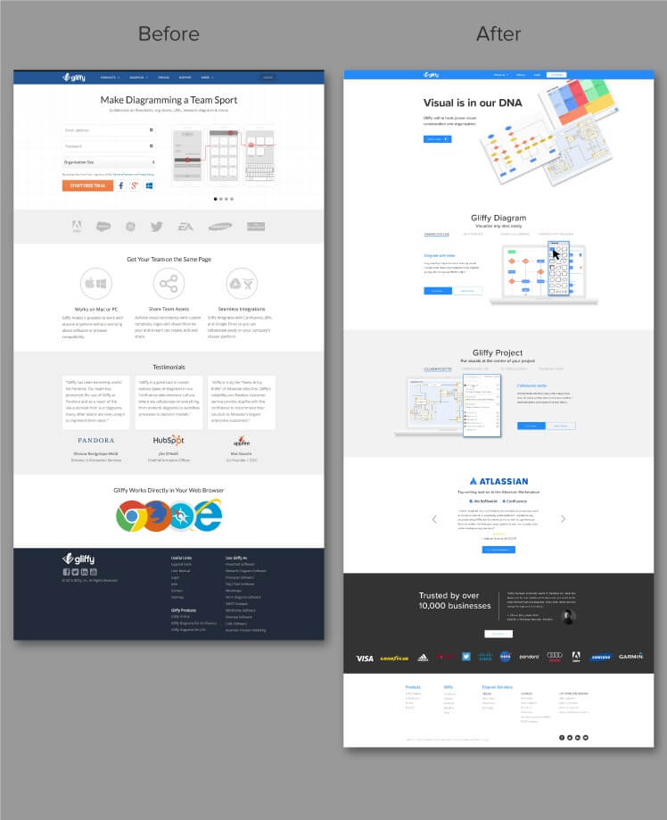
The hero set the tone, for the home page and the entire site. A trinity of screenshots show diagrams and charts created with Gliffy, accompanied by a simple value-driven message. As you scroll, that delicate balance of design, white space and copy is maintained, even in the two product sections.
Product sections tend to be copy-heavy because they describe the features and how they solve the buyers’ problems. To overcome this challenge, we used embedded navigation that only shows one benefit and its description at a time. It’s an approach we mirrored on the Gliffy Diagram page, where it’s imperative to show the multitude of visuals that can be created.
And there’s that word again: show. Screenshots are good. But we thought we could do better. We wanted to show visitors what it’s like to use Gliffy, and so we had Gliffy create GIFs and videos of its products. So now, when you go to the product pages, you immediately experience Gliffy Diagram and Project firsthand.
A Matter Of Trust
It’s amazing how much a redesign can increase customer confidence. But the effect is even more powerful when trust elements are built into the redesign. Gliffy has been successful for over a decade and has the ratings, reviews and clientele to prove it.
Too often, trust sections feel disembodied from the rest of the page, with long lists of customers, industries and testimonials crowded into a small space. With Gliffy, we stayed true to the design, using a slider to present testimonials one at a time and handpicking identifiable customers that represent key industries.
The Numbers Don’t Lie, But Sometimes They’re Misleading
Reviewing the post-launch metrics, one might conclude the redesign was a failure. Users are down 35%, sessions are down 28% and pageviews have decreased 27%. Yet those numbers are misleading. Gliffy always received a lot of traffic but didn’t convert on most of it because it was the wrong traffic.
Early in our SEO research, we found a number of visitors coming to Gliffy via search terms for use cases, such as uml diagram. Though Gliffy ranked well for these educational keywords and was getting traffic from them, searchers were using them to learn, not to shop.
Rather than continuing to focus on those keywords, we targeted conversion keywords, such as uml diagram tool, in which the intent is to find a product, not just information. To that end, since launch, Gliffy:
- Is up nearly 11% in sessions per user
- Is up 10% in average session duration
- Is up 2% in pages per session
- Has reduced its bounce rate by nearly 37%
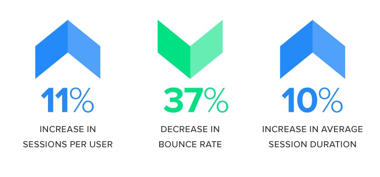
The improvements in these “sticky” metrics reflect our ability to target and attract high-quality visitors with a deep interest in its products.
Perhaps the best outcome of our collaboration with Gliffy is that it was just a first step. Gliffy views the site as a platform to build upon, and since launch we’ve discussed taking advantage of those educational keywords through pillar pages that can convert visitors searching for information into trial users.

Eliminate Hit-or-Miss Marketing Moves
Get advice, tips, tools and guidance to generate more leads for your company in this weekly email newsletter.


The Secret to Generating High-Quality Leads for Your Sales Team

The Secret to Generating High-Quality Leads for Your Sales Team